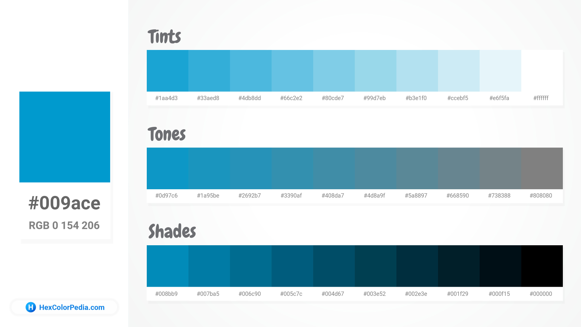
Color trends have a way of circling back. Some shades quietly fade from view, while others burst onto the scene with renewed force. PANTONE Blue 801 C, a vivid and energizing blue, is one such color that designers and brands are revisiting. Its boldness, modern appeal, and nostalgic edge are turning it into a favorite once again. The resurgence of this hue reflects a deeper shift in how color communicates freshness, confidence, and optimism.
A Vibrant Shade Reclaims the Spotlight
Design professionals have always known the power of color to set emotion and tone. Over the last year, PANTONE 801c has seen a remarkable resurgence across multiple design industries. Its crisp cyan undertones make it ideal for creating a strong visual impact without overwhelming the viewer. Whether seen in fashion, branding, or interiors, the shade instantly stands out and captures attention.
The return of this electric blue is no coincidence. Brands seek ways to convey energy, clarity, and innovation, and this color encapsulates all three. Its lively saturation represents modern freshness while remaining rooted in timeless visual appeal.
From Runways to Retail Displays
The influence of this color reaches far beyond the design studio. Fashion labels have reintroduced this blue into their spring and summer collections, pairing it with whites, silvers, and neutral creams. The combination produces a sharp, luxurious contrast that feels both modern and wearable.
Interior designers embrace it too. Accent walls, kitchen tiles, and art pieces in this hue are appearing in stylish homes and high-end commercial spaces. Retailers display the color in window designs to attract attention and convey freshness. Its adaptability to multiple contexts gives it a strong edge over other trend-driven shades.
Why Designers Are Drawn to Its Versatility
Balancing Impact with Simplicity
One reason for this revival is its ability to be both bold and minimal. It brings an instant lift to designs without requiring excessive pairing or detailing. It’s clean, contemporary tone pairs effortlessly with neutral backdrops or metallic accents.
Works Across Various Media
The shade translates beautifully across print, digital screens, and textiles. This flexibility appeals to modern creatives who must adapt visuals across different formats. The consistent vibrancy of this color ensures it maintains its brilliance no matter the surface.
Designers often highlight a few key advantages:
- Creates immediate visual recognition for brands
- Enhances readability when used in moderation
- Reflects modern aesthetics while retaining timelessness
The Cultural Shift Toward Brighter Hues
Design reflects collective moods and global sentiment. In recent years, neutral palettes have dominated due to their calming nature. However, a shift toward self-expression has brought vivid colors back into focus. PANTONE Blue 801 C fits this movement perfectly; it’s assertive but approachable.
Social media aesthetics have also played a role in its comeback. The color’s photogenic quality translates beautifully across platforms, whether on packaging, product photography, or digital advertisements. It captures attention in fast-scrolling environments and helps brands distinguish themselves from competitors.
Color Forecasting and Brand Identity
Experts in color forecasting suggest that the next few years will emphasize hues that communicate clarity and optimism. Brands using this specific blue position themselves as trustworthy yet progressive. It embodies a refined sense of modernity that appeals to audiences who value both style and substance.
Visual identity matters more than ever. Companies look for ways to stand out while maintaining a consistent message. PANTONE Blue 801 C allows them to achieve that balance, bold enough to be memorable, refined enough to feel premium.
The resurgence of this bold hue underscores the importance of color as a communicator of culture and emotion. PANTONE 801c doesn’t just appeal to the eye; it resonates with the spirit of innovation. As industries evolve, the need for fresh yet reliable color choices continues to grow. This shade fills that space perfectly. It represents reinvention without losing authenticity. Designers, brands, and consumers alike find something uplifting in its simplicity and strength.

